Part 2: How to Create Graphs in the OTBI Report: Graphical Representation of the Data in the OTBI report
This is the Second Part of How to create the Graphs in the OTBI Reports. For the First Post , You can refer the . In the First Post , I have 1 to 12 Steps. For the Rest of the Steps after Step 12 , Please refer this Below Post.
Step14:-
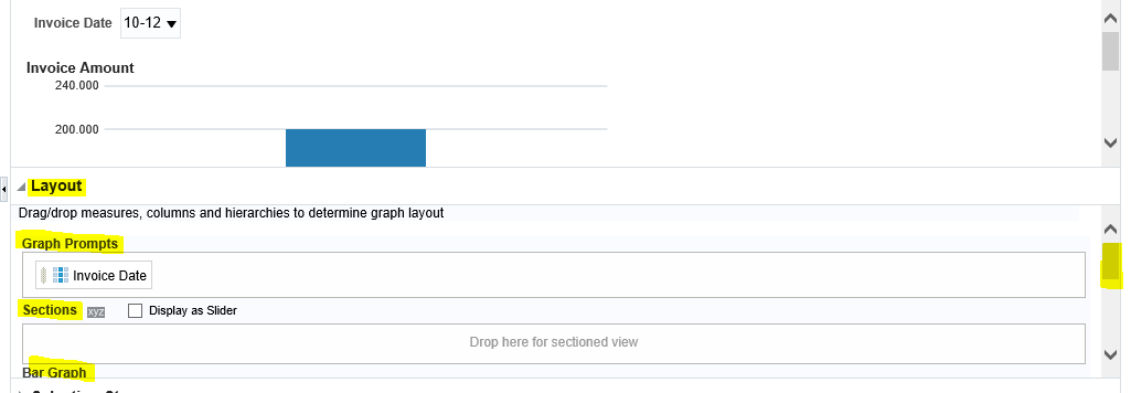
In the Edit , Under Layout , you have Four Sections
1.Graph Prompts: Drag and Drop the Report Column in this Area if you want to Create the Parameters for these Columns in the OTBI Graph Report. I
2.Bar Graph : Put that Column in this Area which will be shown as the Graph Bar (vertically)
3.Bar Group By :- Put that Column as per that You want to see the Data Horizontally.
4.Excluded :- Put that Column which you don't want to see in the Report Output.

Step15:- In my Example , I have use the Supplier Column as a Graph Prompt.
Group By : Invoice Date.
Bars : Invoice Amount.
Excluded : Supplier number (Don't Need in this Report).
Step16:- As below this is the Report Output in the Graph Format.
This is the Second Part of How to create the Graphs in the OTBI Reports. For the First Post , You can refer the . In the First Post , I have 1 to 12 Steps. For the Rest of the Steps after Step 12 , Please refer this Below Post.
Part 2: How to Create Graphs in the OTBI Report: Graphical Representation of the Data in the OTBI report
Step13:- Click on the Edit Icon as below
Step14:-
In the Edit , Under Layout , you have Four Sections
1.Graph Prompts: Drag and Drop the Report Column in this Area if you want to Create the Parameters for these Columns in the OTBI Graph Report. I
2.Bar Graph : Put that Column in this Area which will be shown as the Graph Bar (vertically)
3.Bar Group By :- Put that Column as per that You want to see the Data Horizontally.
4.Excluded :- Put that Column which you don't want to see in the Report Output.

Step15:- In my Example , I have use the Supplier Column as a Graph Prompt.
Group By : Invoice Date.
Bars : Invoice Amount.
Excluded : Supplier number (Don't Need in this Report).
Step16:- As below this is the Report Output in the Graph Format.


0 comments:
Post a Comment